Accessible Tab Panels: aria-labelledby, aria-controls and tabindex=0
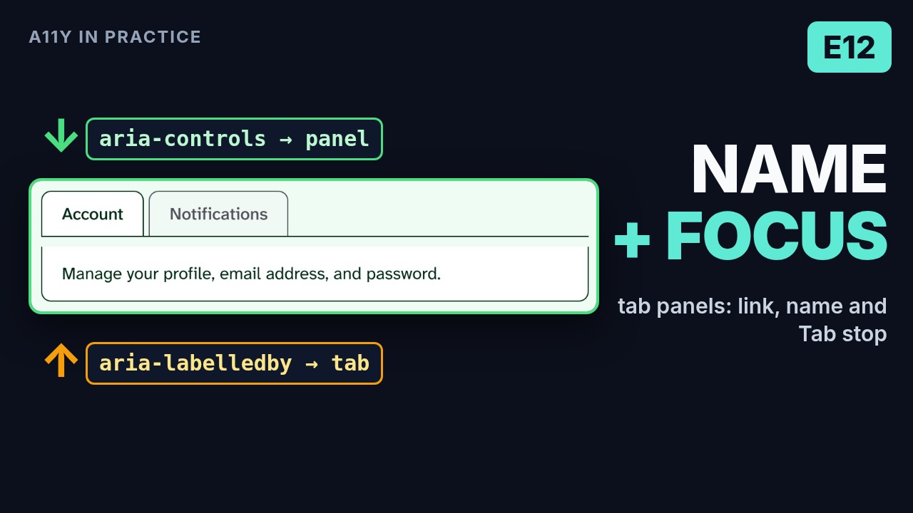
That panel just took a Tab stop. When does it need one, and where does it get its name?
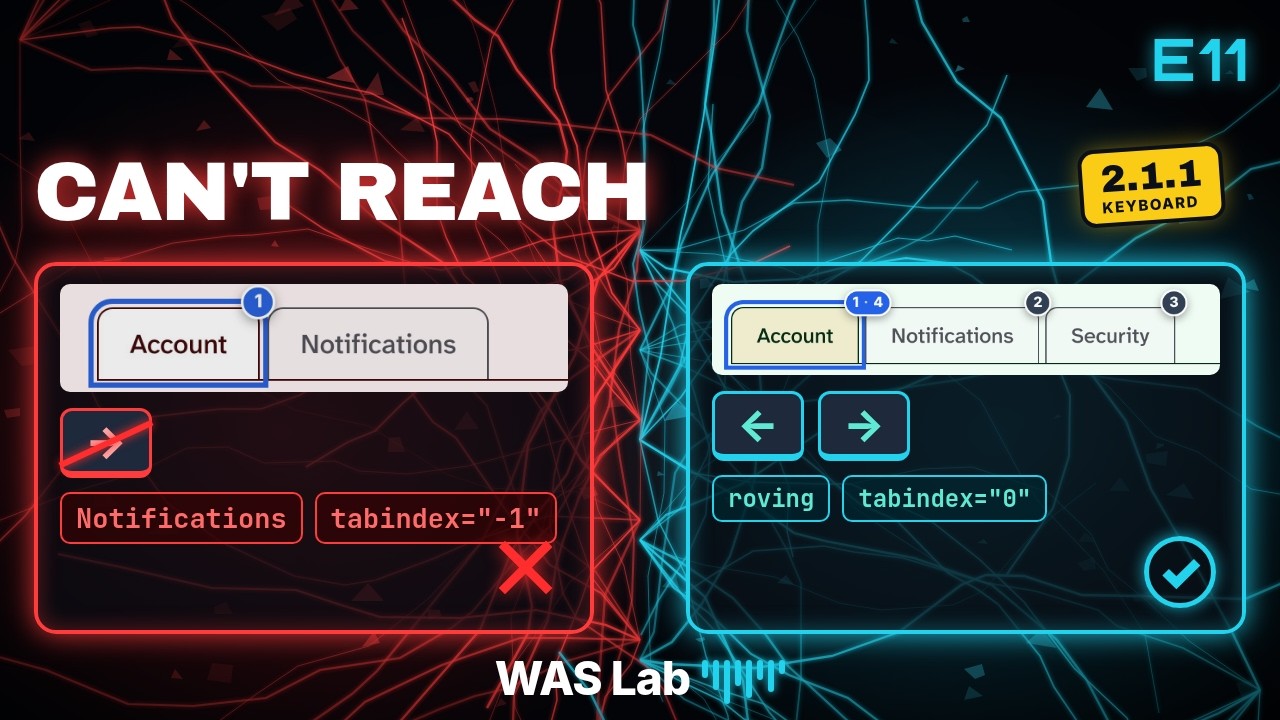
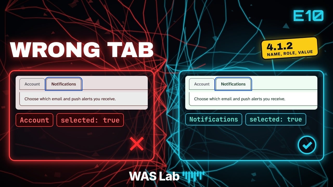
Those were the questions at the end of the previous episode. Episode 10 made the selected state tell the truth. Episode 11 made the tabs reachable with arrow keys and roving tabindex. Now we connect the content.
There are three separate jobs: identify the content as a panel, associate it with its tab and give it a name, then decide where keyboard focus should land. A named panel can still be skipped by Tab. A focusable panel can still have no useful name. One check does not prove the other two.
This walkthrough uses two existing labs honestly: Panel Association for the relationship, and Full Tabs Pattern for the text-only panel's keyboard landing. They do not contain every comparison below.
What the Panel Association lab actually breaks
Broken Case 1 looks convincing. Account and Notifications are native buttons with tab roles, a tablist parent and bound aria-selected. Activate a tab and the content changes. But the content is a plain div, with no panel role, ID or label reference. The tabs have no aria-controls.
The lab's stored Chrome accessibility-tree capture from 2026-06-12 exposes the copy as StaticText, not a named tabpanel. The words are still readable. What is missing is the programmatically expressed relationship that the visual presentation suggests.
Broken Case 2 adds aria-controls, but its values point to IDs that are not present on the mounted content. For Account, the tab points to panel-association-broken-case2-account-panel. The content remains a plain div without that ID. An attribute can be present while its reference points nowhere.
Neither case isolates a missing panel name on an otherwise correct tabpanel. Role, naming and relationship are missing together. The fixed cases repair that wiring together, so do not present the comparison as an experiment changing only aria-labelledby.
Also, neither case proves a keyboard failure. These are native buttons: Tab can reach them, and Enter or Space can activate them. The problem being taught here is the missing semantics and relationship, not mouse-only functionality.
Two references, two directions
In Fixed Case 1, the selected Account tab and its mounted panel use these attributes. This is an attribute-focused excerpt, not a complete widget implementation: styling, event handlers and surrounding markup are omitted.
<button
  type="button"
  role="tab"
  id="panel-association-fixed-case1-account-tab"
  aria-selected="true"
  aria-controls="panel-association-fixed-case1-account-panel"
>
  Account
</button>

<div
  id="panel-association-fixed-case1-account-panel"
  role="tabpanel"
  aria-labelledby="panel-association-fixed-case1-account-tab"
>
  Manage your profile, email address, and password.
</div>
Read the references in opposite directions:
- The tab's
aria-controlspoints forward to the panel's ID. It expresses which panel the tab controls. - The panel's
aria-labelledbypoints back to the tab's ID. The tab's visible text supplies the panel's accessible name: Account. role="tabpanel"identifies the content container as a tab panel.
aria-controls does not supply the panel's name. aria-labelledby does not move focus. Neither implements selection or the arrow-key behavior from Episode 11.
Activate Notifications and inspect its own active pair. The tab ID is panel-association-fixed-case1-notifications-tab; its panel ID is panel-association-fixed-case1-notifications-panel. The panel is labelled by that Notifications tab, not the Account tab.
Check both the value and its target. A copied ID can resolve to the wrong widget just as easily as a missing ID can resolve to nothing. IDs must be unique across the document, including when the same component is rendered more than once.
A boundary in this teaching lab
Panel Association mounts only the active panel in each case. When Notifications is selected, the Account panel unmounts. That means the inactive tab's aria-controls target can be absent even in the fixed example.
Inspecting the active pair demonstrates the intended relationship. It does not prove that every tab's reference resolves simultaneously. The Full Tabs Pattern lab retains all panels in the DOM and hides inactive ones, providing a useful contrast. Keep this caveat in your tests rather than declaring every reference correct after checking only one selected tab.
When does the panel need tabindex=0?
The WAI-ARIA Authoring Practices Tabs pattern explains the focus-entry decision. Keyboard Interaction, Note 4, says:
When the tabpanel does not contain any focusable elements or the first element with content is not focusable, the tabpanel should set
tabindex="0"to include it in the tab sequence of the page.
There are two conditions, not just one. Asking whether the panel contains a button somewhere is not enough. Look at where its meaningful content begins.
| Panel content | Focus-entry decision under APG |
|---|---|
| Text only, no focusable descendants | Give the panel tabindex="0" so it has a keyboard landing place. |
| First meaningful content is a focusable link or control | That first content can receive Tab; a separate panel stop is not automatically needed. |
| Explanatory text first, with a button later | A panel stop gives a landing place before the later button. |
The following two layouts are illustrative markup, not additional cases in either live lab. They show the content-entry distinction, not complete tab widgets. Their associated tabs and full relationship wiring are omitted.
<!-- Illustration: first meaningful content is focusable. -->
<div role="tabpanel" aria-labelledby="example-link-tab">
  <a href="/settings">Open settings</a>
</div>

<!-- Illustration: meaningful text comes before a later control. -->
<div role="tabpanel" aria-labelledby="example-text-tab" tabindex="0">
  <p>Read this explanation before changing settings.</p>
  <button type="button">Change settings</button>
</div>
Do not add an extra stop to every container by habit. Equally, do not remove a panel stop just because a later descendant happens to be focusable. The APG recommendation is about reaching the beginning of the panel's content.
Keyboard proof belongs in Full Tabs Pattern
The association lab's fixed panels have no tabindex="0". It also leaves tabs in their native Tab order and does not implement the arrow-key pattern. Its fixed label means the relationship is fixed, not that it demonstrates every part of a complete tabs interaction.
For the panel stop, return explicitly to Full Tabs Pattern. Its panels contain text, with no focusable descendants. The implementation gives each panel tabIndex={0}, names it from its tab, retains it in the DOM with hidden when inactive, and applies the site's focus-ring styling.
Episode 11's 2026-11-01 headless Chromium capture documented focus moving to the Notifications panel after Tab. Its tree row showed tabpanel "Notifications" with focusable: true and focused: true. That is historical browser evidence, not a new test or a VoiceOver announcement for this post.
Notice what each layer proves. Elements exposes the actual tabindex and ID references. The accessibility tree exposes the role, computed name and focus state that Chrome reports. A real keyboard pass establishes where Tab and Shift+Tab actually go. None is a substitute for the others.
What to report, and what not to report
1.3.1 Info and Relationships is the central relationship question: is the visually conveyed tab-to-content relationship programmatically determinable? 4.1.2 Name, Role, Value requires examining the intended component's role and naming in context. The missing panel semantics matter; a plain content div is not automatically an unnamed UI control just because it is a div.
APG is guidance, not a WCAG requirement. A missing static-text panel stop is not automatically a 2.1.1 Keyboard failure. Screen reader reading navigation is different from sequential keyboard focus. If functionality cannot be operated through a keyboard interface, assess 2.1.1 based on that actual inoperability.
Similarly, 2.4.7 Focus Visible matters when keyboard focus lacks a visible indicator. A newly focusable panel needs a visible focus treatment. This episode does not demonstrate a broken-ring case or establish a new 2.4.7 failure.
Report the observed problem, not a count of missing attributes. Do not turn every APG recommendation into a WCAG failure badge.
Behaviors to verify
- Select Account in the association case under test. Resolve the selected tab's
aria-controlsto the intended mounted panel, not an unrelated element. - Check the panel's role and accessible name. Follow
aria-labelledbyto the actual Account tab ID; do not stop at attribute presence. - Activate Notifications and repeat on its own active pair. Check unique IDs and keep inactive-reference integrity as a separate check.
- In Full Tabs Pattern, move to the selected tab and press Tab. Verify focus lands on its visible text-only panel, with a visible ring. Check that hidden panels do not become extra stops.
- Press Tab again, then reverse with Shift+Tab. Verify a sensible path without trapping focus. If reviewing a different widget with links or buttons, inspect its first meaningful content before deciding whether the panel needs a stop.
VoiceOver on Mac can provide another reading-navigation check, but no announcement needs to be invented to explain this fix. This post uses the documented tree evidence and keeps that separate from keyboard-focus behavior.
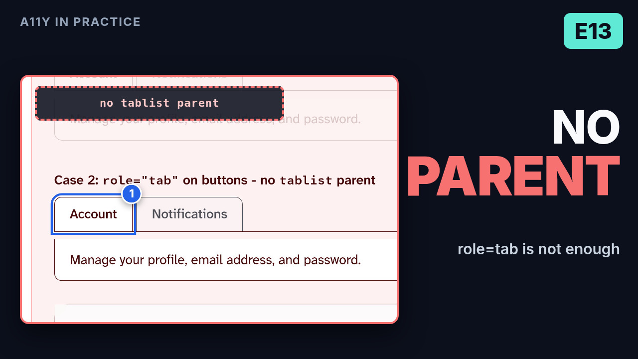
The next episode returns to another structural question: a tab without a tablist, and why the tab needs its parent.
Practice it
- Video: https://youtu.be/shC4nEYOmys
- Lab: Panel Association lab
- Focus entry on a text-only panel: Full Tabs Pattern lab
- Related WAS rules: Custom Widgets
- The selected state on the same tabs (E10): The Selected Tab That Lies
- Arrow keys and roving tabindex on the same tabs (E11): The Tab Your Keyboard Can't Reach
- Original write-up on WAS Lab: https://www.wasexamprep.com/blog/tab-panel-name-and-focus
Takeaway: a tab panel has three jobs. role="tabpanel" identifies it, aria-controls points forward from the tab and aria-labelledby points back to name it, and focus entry is a separate decision. Check that every reference resolves, not just that the attribute exists. A text-only panel stop is APG guidance, not a WCAG requirement, and neither broken case here is a keyboard failure.
If this was useful, subscribe to A11Y in Practice on YouTube (@a11yinpractice) for more hands-on accessibility episodes, and visit wasexamprep.com for WAS study notes and labs.
A11Y in Practice and wasexamprep.com are independent educational resources. They are not affiliated with or endorsed by IAAP (International Association of Accessibility Professionals).
Comments
Join the discussionThe two-directions framing is the clearest explanation of this I have seen — aria-controls points forward from the tab to the panel, and aria-labelledby points back so the panel takes its name from the tab's visible text. The broken-case examples land well too, especially the one where aria-controls is present but points at an ID that is not mounted anywhere: the attribute looks correct and the relationship still does not exist. I also appreciated the restraint in the reporting section — the APG as guidance rather than a WCAG requirement, and reporting the observed problem instead of counting missing attributes. The tabindex=0 decision table for text-only panels versus panels whose first content is focusable is something I will keep in mind the next time I build tabs.
Thanks, really glad the two-directions framing clicked. The unmounted-ID case is the one I see most in real audits, because the markup looks right in the source and only breaks at runtime, so checking the accessibility tree (or listening with VoiceOver) is the only reliable test. And yes, keeping APG as guidance rather than a WCAG requirement matters a lot when writing up findings. Thanks for reading!